Blog - How a visual identity evolves over time: Where does the Medical Council’s logo come from?
As the regulator of doctors in Ireland, the Medical Council’s purpose is public protection, ensuring safe and professional doctors. This purpose guides everything we do – including how we communicate, and how we interact with doctors, patients, and the public.
One element of how we communicate with the public is via our visual identity. The Medical Council was established in 1978 following the enactment of the Medical Practitioners Act 1978. The Register of Medical Practitioners replaced the register established under the Medical Practitioners Act 1927 on 1st July 1980. Several iterations of our logo have been used since then, but the ‘Rod of Asclepius’ has remained a constant recognisable element throughout the years.
A staff or rod with a serpent or snake has long been a symbol of medicine and the medical profession. It originates from the story of Asclepius, who was thought in ancient Greek times to be a god of healing and whose cult involved the use of snakes. Asclepius was so successful at saving lives that, the legend goes, Hades the god of the underworld complained about him to the supreme god Zeus who, fearing that the healer might make humans immortal, killed Asclepius with a thunderbolt.
Many variations of the rod of Asclepius are used in the visual brand identity of of medical and healthcare organisations. For example, the World Health Organisation’s emblem consists of the United Nations symbol surmounted by a staff with a snake coiling round it.
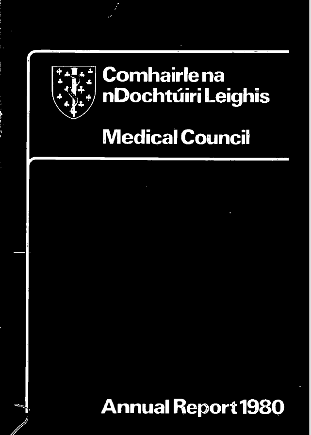
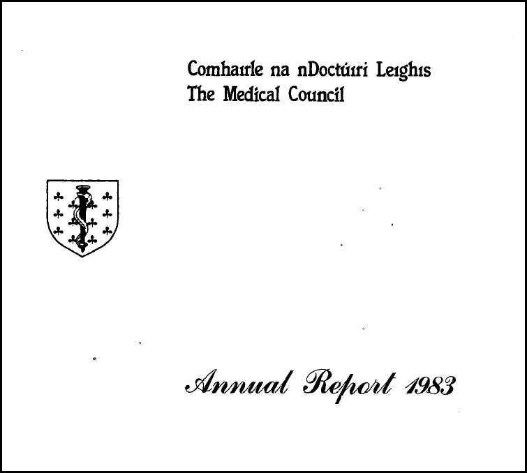
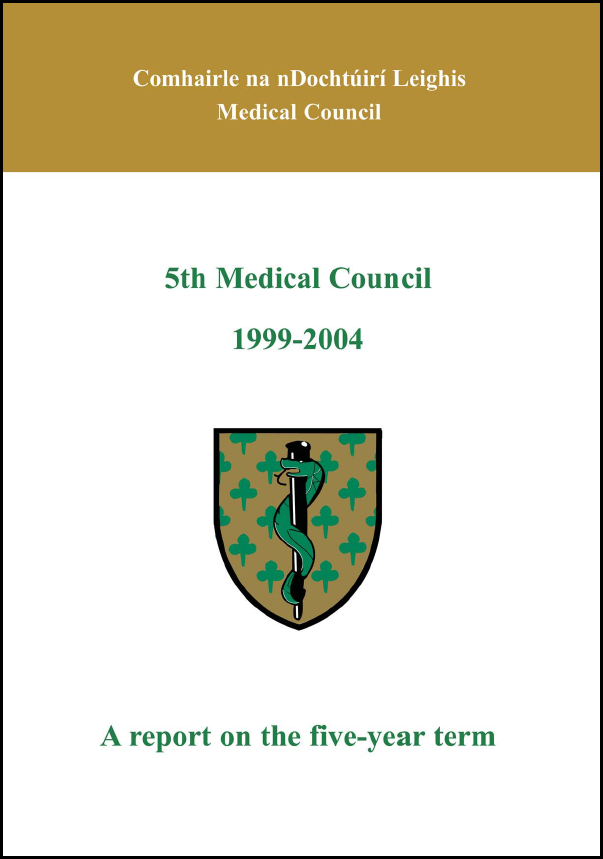
It is therefore unsurprising that the Medical Council of Ireland’s first ever registered crest was designed to depict the Rod of Asclepius against a shield, with shamrocks on the shield likely used to convey the Irish element of our organisation.
In 2011, our organisation’s logo evolved further. The crest was slimmed down, and the serpent turned to face right instead of left. This version of the logo was brought into a more contemporary format for that time, suitable for printing and digital usage. In line with the Official Languages Act 2003, our full logo was updated to include the Irish version of the Medical Council’s name – Comhairle na nDochtúirí Leighis.
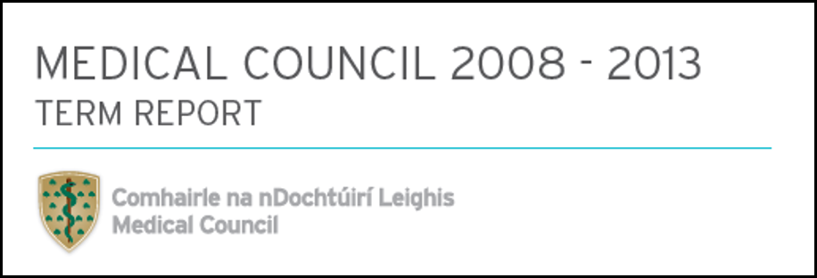
Today, our logo has been updated for readability and accessibility, as well as for web use. In some ways, we’re embracing our heritage by going back to the original 1985 rounded, well-structured crest shape, and including more detail in the serpent.
A cohesive image helps people to recognise and remember an organisation. Throughout the years, our logo has evolved, but the rod of Asclepius has remained. This new interpretation of our crest and logo has been designed to be progressive, elegant, and aims to be accessible for everyone. It holds our evolved interpretation of the Rod of Asclepius, and eight shamrocks.
We hope that this evolution helps people to understand who we are, what we do and how we protect the public through the effective regulation of doctors.